Main Objective:
This notebook aims to uncover distributional imbalances by combining demographic data (age, gender, location) from the Candidates sheet of the reverse matching dataset and skill data extracted by the parser from raw CVs.
Steps:
Analyze distributional skews
Gender distribution
Location distribution
Hard vs. soft skills distribution
Visualize imbalances
Use bar charts to highlight over or under representation.
First analysis of parser induced bias
Identify patterns where the parser may systematically favor or overlook certain groups or skill types.
Why This Matters
Detecting these imbalances is critical to designing a robust, fair pipeline that flags and mitigates biases introduced by the CV parser relying only on raw CV inputs and their parsed outputs.
Merge & prepare data
Bring together candidate demographic data and their extracted skills.
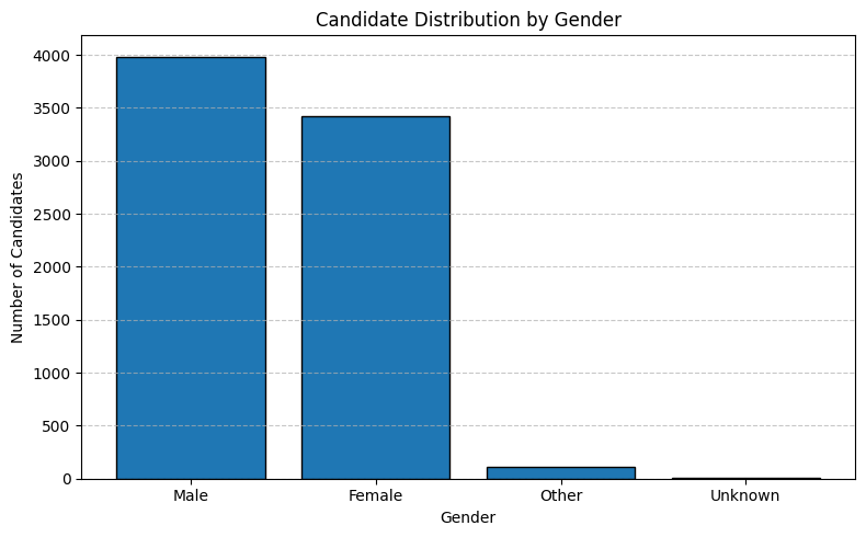
We begin by examining the overall gender composition of the candidate pool, which shows 53.0% male and 45.5% female, therefore rather balanced and a small fraction identifying as “Other” or “Unknown.”
plot_distribution_bar( gender_counts_df, x_col="Gender", y_col="count", x_label="Gender", y_label="Number of Candidates", title="Candidate Distribution by Gender",)
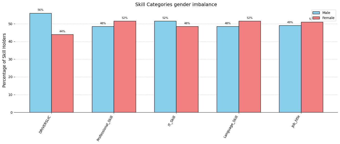
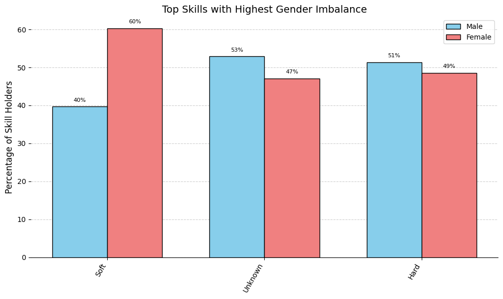
Now we compute for each skill type the counts and percentages of male vs. female candidates and their differences.
Steps:
Count males and females per skill type. These counts are normalized with respect to the prior distribution.
Calculate total count, percent female/male (rounded to 1 decimal), absolute and percentage differences.
We identify skill categories with the gender imbalance, highlighting those that are disproportionately associated with either male or female candidates.
Now we analyze gender representation across parsed skills by computing both absolute counts (normalized by prior distribution) and relative percentages for male and female candidates. The objective is to identify skills that show a significant gender imbalance.
We group the data by each unique combination of Skill and Skill_Type and compute the following:
count_male: number of male candidates who have the skill
count_female: number of female candidates who have the skill
count_total = count_male + count_female
perc_male = (count_male / count_total) × 100
perc_female = (count_female / count_total) × 100
perc_diff = perc_male - perc_female
count_diff = count_male - count_female
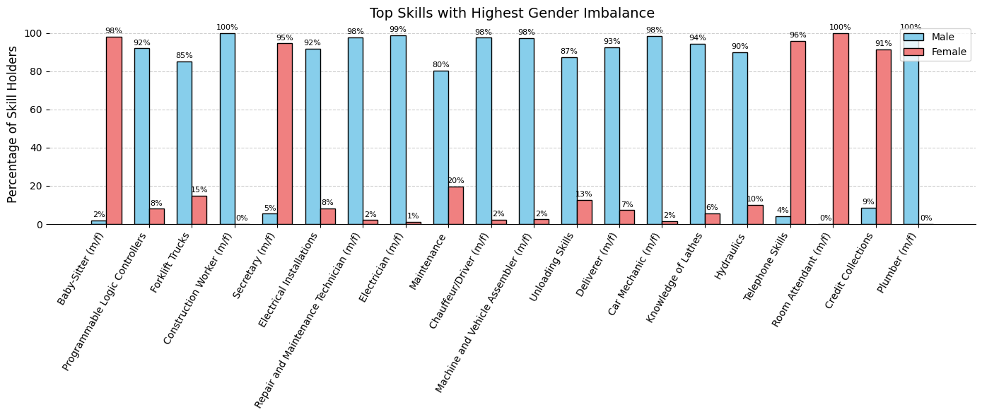
To quantify the strength of gender bias for each skill, we define the following metric:
Note: From these results, we can see that certain skills known to be heavily “gender skewed” in society have been identified. Although a high perc_diff highlights strong imbalances, it alone would also find rare skills with extreme ratios (for example, 1 occurrence versus 0). By adding a logarithmic term based on counts, we ensure that only skills with both a large percentage difference and a sufficiently high frequency rise to the top. This bias_strenght metric therefore uncovers the most widespread, gender-biased skills in our dataset.
plot_bias_skills_bar( df_gender_bias,"Skill", gender_percs_dict,"bias_strength","Top Skills with Highest Gender Imbalance", top_n=20, colors=gender_colors,)
In this section, we’re going to examine gender bias in the candidates job experiences (Job Titles) to understand how they differ for male and female candidates.
For doing this we append two new columns perc_female_zippia and perc_male_zippia by scraping Zippia (USA) for the percentage of men and women in each role.
By this we’ll see whether the same male/female proportions that we observe in our parsed skills and roles align with the real world distribution of those occupations. This will determine whether observed disparities could reflect parser errors or real world biases already present in our CVs.
Example: If our parsed CVs dataset shows that 10% of “Software Engineer” CVs are female but Zippia reports 30%, this gap may indicate a parser bias. Conversely, if both sources match closely, it could suggests that any skew is likely a reflection of broader societal patterns rather than a flaw in the parser extraction process.
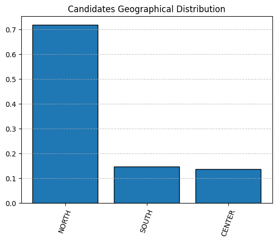
This distribution reveals a pronounced geographic imbalance: with nearly three‐quarters of candidates (~71%) coming from the North and very few from the Center (~14%) or South (~15%); the pool is heavily skewed toward Northern regions.
This pronounced skew must be taken into account in all subsequent analyses.
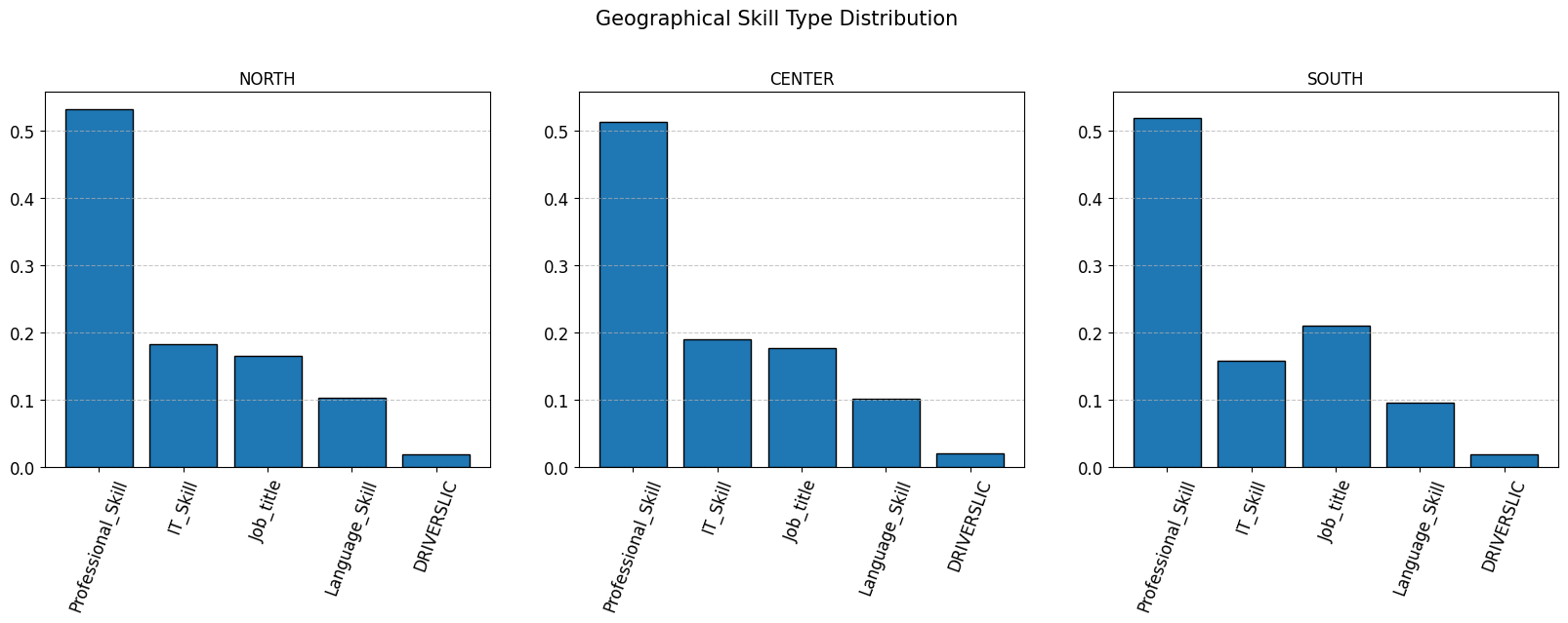
The charts below display the percentage distribution of each Skill_Type within three geographic regions (North, Center, South). Each histogram is normalized, so differences in absolute CV counts do not affect the shape of the distribution across regions. The y-axis values represent the relative share of each skill type among CVs from that specific area, regardless of the total volume of CVs.
Note: The only noticeable difference is that in the South, the Job_title category is slightly more prevalent than IT_Skill. In the North and Center, these two categories remain roughly similar. All other proportions (e.g., the dominance of Professional_Skill and the marginal share of DRIVERSLIC) are nearly identical across regions.
skills_per_location = split_df_per_attribute(df_skill_candidates_localized, "Location")plot_target_distribution(skills_per_location, "Geographical Skill Type Distribution")
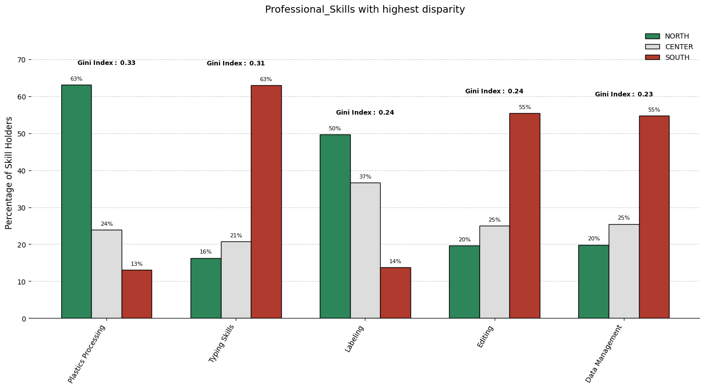
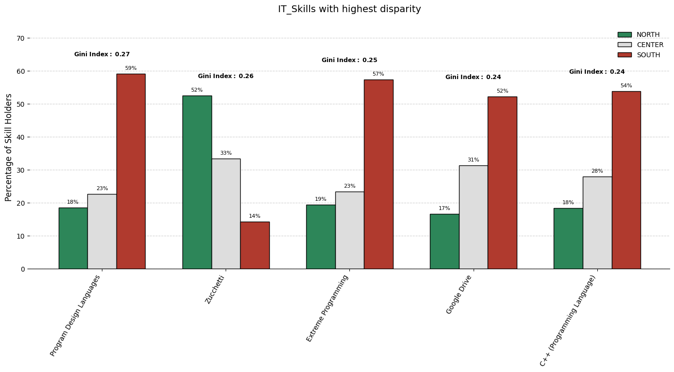
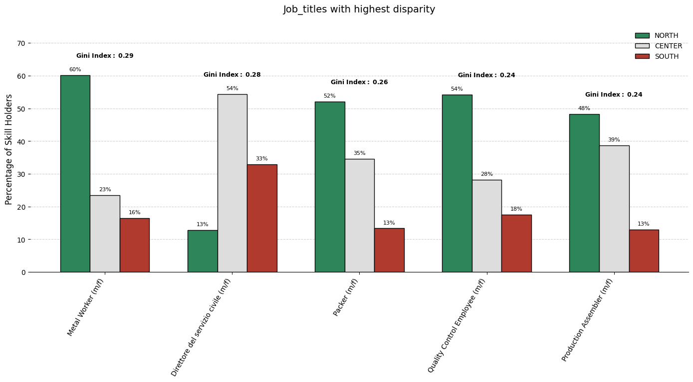
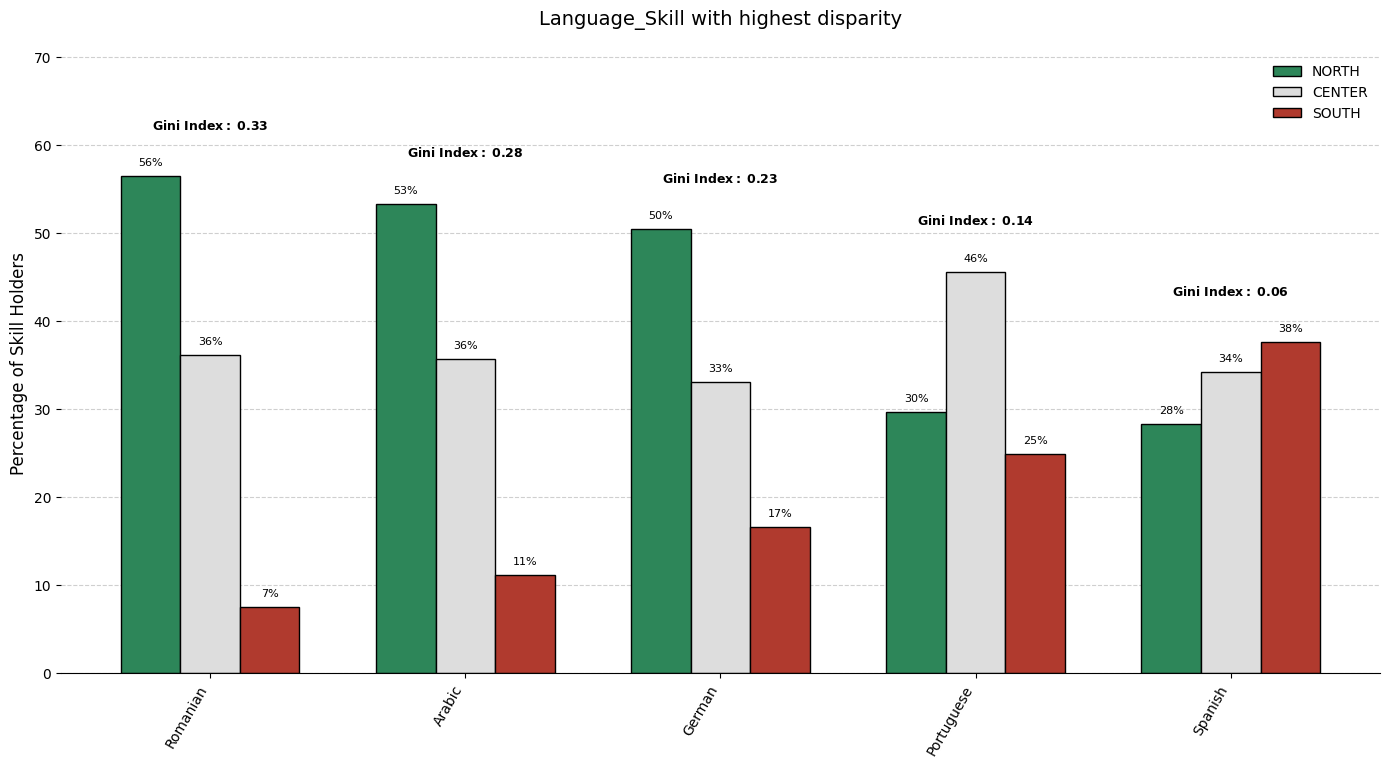
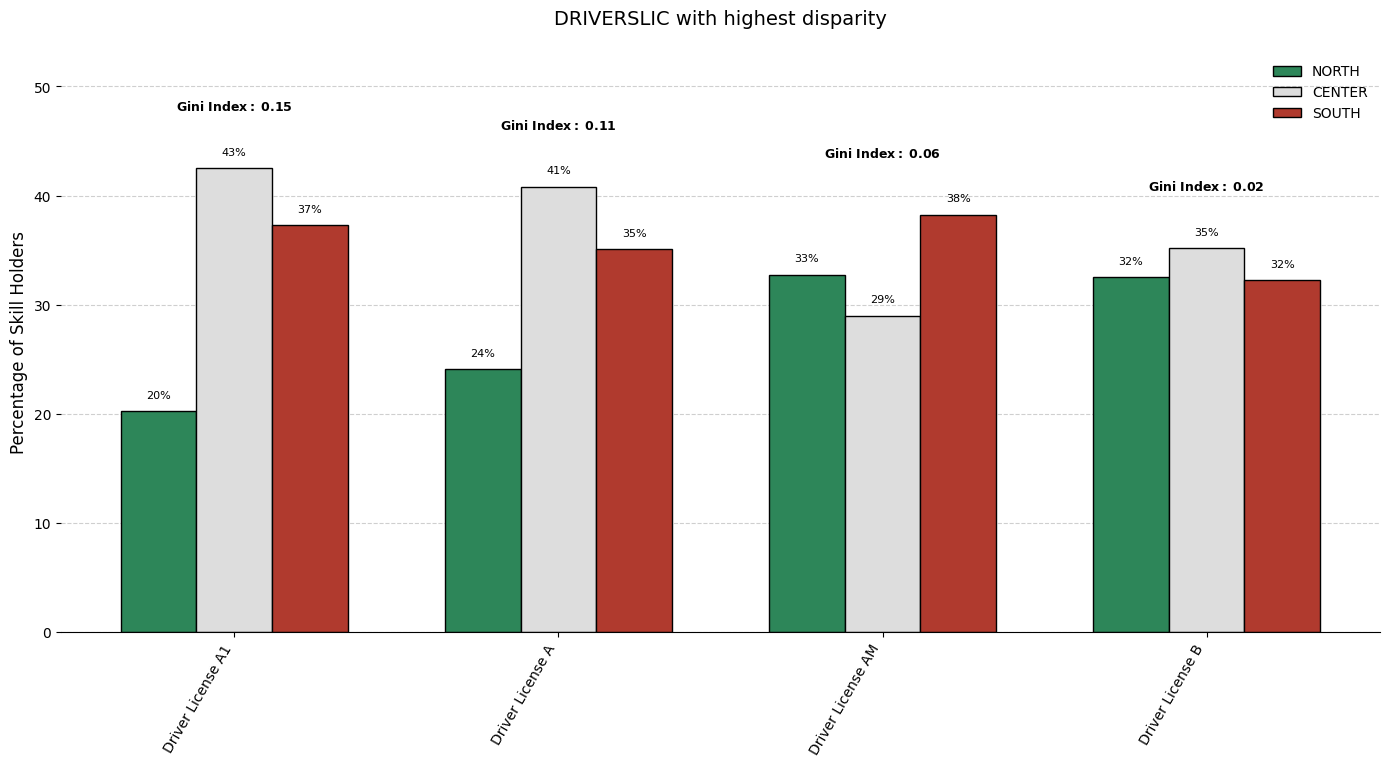
When comparing how specific skills are distributed across multiple geographic regions, it is crucial to identify which skills exhibit the most pronounced imbalance. The technique employed here involves:
Cutting out low frequencies skills: first applying log trasformation on the total counts distribution, then computing z-score for each count and lastly filtering out those that are below a certain threshold.
Gathering frequency counts (already scaled considering the groups prior distribution) of each skill within each group. (considering only skills as described in 1.)
Quantifying inequality for each skill across these groups using a statistical measure.
Selecting the top skills with the maximum inequality and visualizing its breakdown to facilitate interpretation.
The Gini Index as an Inequality Metric
The chosen disparity metric is the Gini index, a widely used measure of statistical dispersion. For a given skill, let \(n\) be the number of groups and let \(x_i\) denote the frequency of that skill in group \(i\). We denote them by \(x_{(1)}\), \(x_{(2)}\), \(...\), \(x_{(n)}\). (in our case \(n=3\)) The Gini index is then computed as:
\[
G \;=\; \frac{\displaystyle\sum_{1 \,\le i < j \,\le n} \bigl|x_i - x_j\bigr|}{\,n \,\sum_{i=1}^{n} x_i\,}\,
\]
How this works:
Intuition:
It measures the average absolute difference between every pair of group values, scaled by the total.
If all \(x_i\) are identical, each \(\lvert x_i - x_j\rvert = 0\), so \(G=0\) (perfect equality).
If one group has all of the mass and the others have zero, then the numerator is maximized, driving \(G\) toward 1 (maximal inequality).
Normalization:
Dividing by \(n \sum_{i=1}^{n} x_i\) ensures \(G\) ranges between 0 and (just under) 1 regardless of absolute scale or number of groups.
In practice, \(G\) approaches 1 when one group’s share dominates and the rest contribute negligibly.
Interpretation:
A low Gini (near 0) indicates the attribute is nearly equally represented across all groups.
A high Gini signals that the attribute is concentrated in one or a few groups, revealing a strong disparity.
Note: The Gini index’s maximum value is \((n-1)/n\). For \(n=3\), this gives a range from 0 up to \(2/3\) (approximately 0.667).
As we can see from the chart below, soft skills are prevalent for female candidates. (counts are normalized, as before, considering the prior distribution)